The following blog is written by Root’s CEO, Rich Berens, and is a modified excerpt from the book he recently co-authored with Root co-founder Jim Haudan. This piece discusses the power of visualization and shows how critical it is to verify that what you are saying really is in fact, what you mean.
We’ve all heard the phrase “a picture is worth a thousand words.” We have found that to be exceedingly true in business. As a matter of fact, the right use of visualization is one of the most effective ways to align leaders on critical business issues.
We had the opportunity to work with a global chemical company, and one of the objectives was to capture the story of their strategy so we could engage the larger organization more effectively in it. The change required restructuring of the organization itself and was impacting a lot of people. It was critical to clearly outline the why, what, and how of the change to employees. And, it was essential that all team members had a clear sense of why this was happening, why they should want to be on this journey, and how they could contribute in the best way.
We had an interview session with the CEO as well as the head of strategy where we rigorously took notes to capture our discussion. Then we returned to our offices and spent time with one of our concept artists to work through the story and capture the essence as we heard it. Armed with a tight outline and a sketch we felt good about, we returned to the CEO and head of strategy a few days later. After we revealed the sketch and shared our version of the story, both of them looked at the sketch for an extended period of time, quietly absorbing it. Then the dialogue went something like this:
CEO: I am not sure you were fully listening to me or you understood our strategy because you really missed the essence here.
Head of strategy: I actually think it’s quite good, and it really captures the story we have been talking about.
CEO: No, it doesn’t. It doesn’t capture the essence of the shift—and ultimately our strategy— really well.
Head of strategy: Well, I think this represents exactly what you said.
CEO: One thing is for sure, if that is what I said, it is not what I meant. It doesn’t convey it the right way.
Aligning What You Say and What You Mean
Let’s allow that to sink in for a moment: “If that is what I said, it is not what I meant.” Aligning what you say and what that means in your head and conveying that exact message to someone else is quite hard. Aligning on words is easy. Aligning on the meaning behind those words to have a common story or view of the system is very different.
Our brain has the ability to process complex information and give it meaning a lot faster visually than through the written word. Pictures result in almost instant recognition because the speed of processing complex information when using visualization is beyond reproach. So, the question is really: Why don’t we use visualization more often when explaining complex things? The data is obvious—visuals are the superior way to achieve shared meaning.
Robert E. Horn, a renowned scholar who has taught at Harvard, Columbia, and Stanford, might have said it best at a meeting at the National Science Foundation when he stated that “visual language has the potential for increasing ‘human bandwidth’—the capacity to take in, comprehend, and more efficiently synthesize large amounts of new information.”
Shared meaning ensures that our story goes beyond common words but has a much deeper sense of shared understanding, alignment, and ultimately meaning to people. Doing this effectively is the difference between people partially understanding your story and not getting in the way of it, and owning your story and being advocates for it.
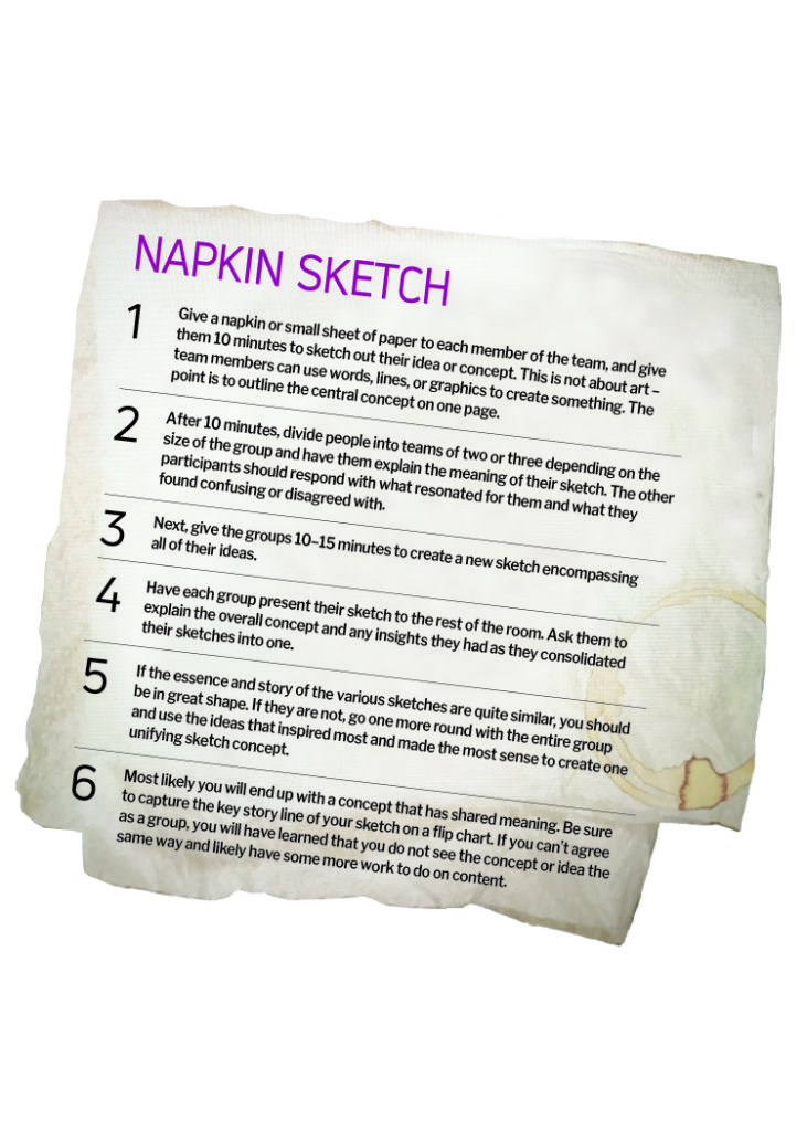
How might you use visualization to create shared meaning without an artist or designer in the room? Consider the many times you have used or witnessed someone trying to get their ideas across by drawing images, arrows, or word pictures on a napkin to express in detail something that they were excited about. The napkin sketch framework below gives you a great way to use visualization to create shared meaning without having to be an expert.


